

Front Covers


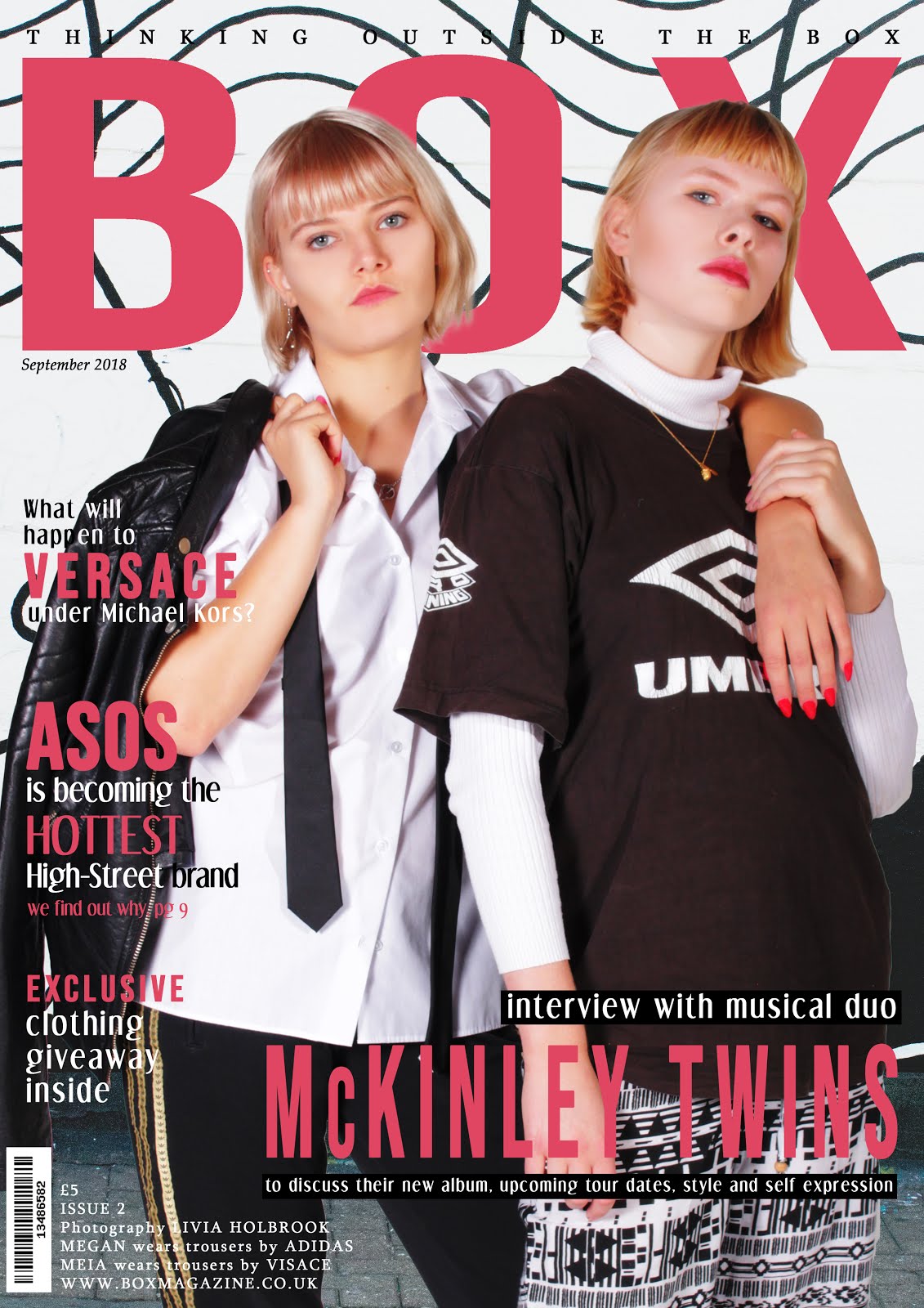
This cover is more minimalist than most fashion magazines, with a plain background and little information about the issue inside. The magazine name is in large print alongside the model, and contains the hidden logo of a winking face, which the model also expresses. This use of hidden connotations allows the target audience to engage with the magazine. The subheading 'Super Youth' addresses the target audience and appeals to the young demographic, a technique documented by Barthes in his theory of Identity. I really like the striking hair and makeup of the model and how this contrasts her dark clothes. Again, this magazine has utilised complementary colours, matching the subtext colour to the nail varnish of the model.

Based on my research, I can identify the main features of conventional magazines and incorporate these in my own magazine covers. These include
- main image of a model - this will often show the magazine's brand identity and highlight to the reader the genre and intended target audience of the magazine.
- background - often plain colours or a gradient, can also be a location shot which is typically out of focus to highlight the model
- masthead - a key part of the magazines branding found at the top of the page in a bold font
- headlines - the number of these on the cover varies; more will suggest that the magazine is packed with content but connote a gossip style, whereas less will show the magazines sophisticated style
- issue number and date - often in the top left corner
- bar code - often found in the bottom right corner
- price - in variable positions
- tagline - reinforces brand identity and magazine purpose
- call to action to the website- to encourage readers to look for more content online.
- direct address- can be done through the model's body language or through the choice of language. This can create a connection between the reader and magazine and encourage them to purchase it.
- colour palette - a clear colour scheme that can used to link different elements on a cover or add aesthetic
- semiotics - signs and symbols create representations which the audience can identify with/understand. Barthes explores the ways elements present connotations to be decoded by the audience
Contents Pages


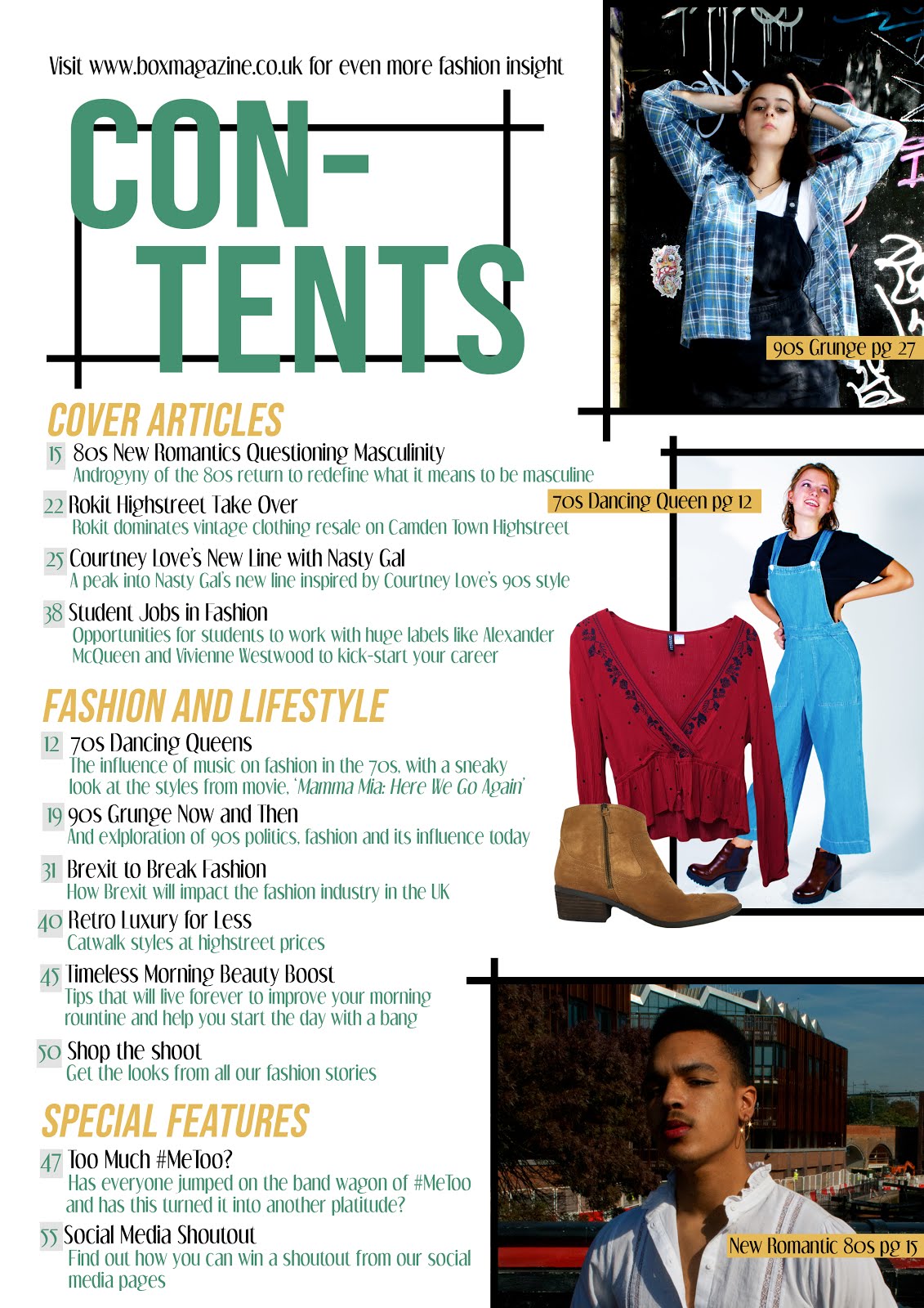
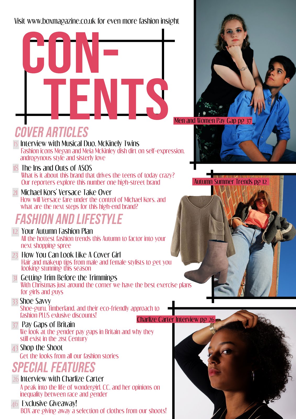
- a grid layout with lists of articles and page numbers.
- white background - this draws the readers attention to the images and contents headlines featured
- a collection of images - can be spread out or overlapping with the contents running down the side
- a masthead- will normally contain a large 'contents' heading and some may have the magazine's title instead or in addition
- can be a single or double page spread
- a web address or information on how to subscribe to the magazine featured at the bottom or top of the page
Websites
The website of a magazine is used to provide their audience with information about the brand and encourage them to buy it. It also provides audiences with the opportunity for interactivity, enabling them to navigate the site, view media and subscribe to the magazine or newsletters.

This website has a white main background which draws more attention to the images and text. It features social media links in the top right corner. The title of the magazine and a menu bar feature center-top. There is a large image extending across the whole width of the page with a link to the article it references. Below this there is a large call to action to subscribe to the magazine and weekly newsletter. Similarly, in the top left there is a link to subscribe to the magazine with images of the most recent cover. There is a search bar in the middle of the page. As you scroll down the page, articles and features are laid out in a grid format and separated into categories such as 'Fashion' and 'Lifestyle'.


This is an additional fashion page for the same website. The formatting is very similar to the homepage, with a grid of articles which open up in separate tabs The title and logo of the magazine is still featured in the masthead and the drop-down menu is still accessible from the top left.
 Websites also commonly show a small thumbnail of their latest issue in the top left corner of the website header. This is accompanied by a short line about subscription details and a link to subscribe to the magazine.
Based on my research I can identify the main features of conventional websites and incorporate these in my own. These conventions are as follows:
- a main menu bar - normally at the top of the page beneath the masthead
- links to different pages of the website - normally related to featured images
- the magazine's title and logo - often at the top of the page in the masthead
- the magazine's tagline - often included in the masthead below the title
- subscription - constant promotion and buttons to subscribe
- landing page - a tab popping up when the website first opens which greets the viewer and encourages them to subscribe to the magazine
- social media links - normally in the top right corner
- footer with options for subscription, information and contact link
- audio-visual content - found throughout the website to engage audience
- white background with a grid format of images
- Synergy - the stories overlap with others featured in the physical magazines and sometimes provide further detail. The articles also cross over with their social media pages
- a search bar - can be in at the top of the page near the menu or under the masthead
- a variety of different images with links to different pages on the website
No comments:
Post a Comment