Dear Moderator/Examiner,
I hope you enjoy reading through my A-Level work. You will find everything under the 'NEA A Level Research and Planning' label on the right-hand side.
Many thanks, Livia
This blog is now closed.
Website

Click here to see my website
Edition 1 Front Cover

Click here to see my Edition 1 Front Cover
Edition 1 Contents Page
Click to see my Edition 1 Contents Page
Edition 2 Front Cover
Click here to see my Edition 2 Front Cover
Edition 2 Contents Page
Click here to see my Edition 2 Contents Page
Friday, 2 November 2018
Tuesday, 30 October 2018
10. Reflections on Finished Outcomes/Target Audience Response
Target Audience Feedback
Covers and Contents Pages


 In general, the majority of the feedback was very positive. 8/10 people agreed that the magazine was appropriate for the 16-25 market, and those who disagreed were both males. This correlates with my feedback that only 7/10 agreed the magazine appealed to both men and women. This has indicated that if I were to change my product, I would have to add more male-oriented content in order to captivate the unisex market. 100% of those I asked agreed that the opinions reflected in my product matched their own ideals as well as targeting a sophisticated and fashion-savvy market. 50% of people agreed that they would purchase the magazine if they saw it on a retail shelf, which suggests my magazine is more niche than mainstream, conforming to the conventions of an independently produced fashion magazine, however if I were to make changes I may have included more mainstream imagery to appeal to a wider audience. A common additional comment was that my contents page was quite crowded, so I could have made my text and images smaller to create more space and not overwhelm my audience.
Website

Final Reflections
In conclusion, I am very satisfied with my outcomes of this project. I believe there were only minor issues with my print work in terms of appealing to my demographic and overall their aesthetic and representation of values was a huge success. I am most pleased with my website which not only specifically appeals to my target audience, but is also engaging, attractive and presents positive messages around self-acceptance, equality and diversity.
Sunday, 28 October 2018
9. 2nd WEBPAGE
Mockup
I created a mockup of my 2nd webpage using Publisher. For my second webpage, I wanted to create a fashion page, as this is the main focus of my magazine. This page will include the same header as my homepage, and once selected from the navigation bar will be highlighted. At the top of the page will be an advert, which I will create, for a clothing store. Below this will be a scrolling slideshow which will show images of clothing and brands with links to websites where you can buy the products.
Finished Product

I created an advert for H&M which I featured at the top of my Fashion page underneath the header. I chose H&M as this is a brand which is very popular among my 16-25 demographic. Below this I created a small graphic which states 'Be bold, Be new, Be you' which I believe promotes my magazine's purpose of inspiring individuality and diversity among young people. The subtitle 'we feature fashion for guys, girls and everyone in between' further enforces my magazine's value of acceptance and equality. Under this is a direct address call to my audience and a link to subscribe to my magazine.

This is one of three scrolling slides which are featured on my Fashion page. Each slide shows products, a mixture of male and female, with prices and links to buy them online. This slide in particular appeals to my target audience as it features a range of recognisable brands which are popular among both girls and guys within the 16-25, culturally sophisticated demographic. It also uses direct address which draws in the viewer and makes them feel included.

These are the two stories featured on this page. The section title 'this week's highlights' indicates that the stories will change every week to keep my audience constantly updated and informed, demonstrating the immediacy and relevance of my magazine.
The first article specifically appeals to my target audience because it is about a niche fashion designer who has just released a unisex line which appeals to my male, female and androgynous audiences. The article also talks about self-expression which reflects my magazine's values. The text ends on an ellipse with a link to 'read more' which entices my audience to click and travel further onto my website. This provides audience engagement and interactivity.
The second article has a catchy title and is about the very popular clothing store, Uniqlo, making it appealing to my target audience. The article also provides insight into new clothing ranges from the store with exclusive information, demonstrating how my magazine values current news and regular updates.

At the bottom of my Fashion page is a form for my audience to fill out to enter a prize draw. This shows how my magazine enjoys interacting with its audience and provides viewers with an element of interaction and engagement. This prize draw was also promoted on my magazine's Instagram and Twitter feeds, helping my magazine connect with a wider audience, as well as demonstrating my brand's synergy.
Here is a link to my 2nd Webpage
Friday, 26 October 2018
8. Website Homepage
Initial Concept Sketch
Mockup
Finished Product

When my audience first arrive on my website they are greeted by a popup landing page which welcomes them and encourages them to subscribe to my magazine with the deal of getting their first issue free. This makes my demographic more likely to subscribe to my magazine as they can try out the first issue free and see if they like the magazine.

This is the header of my website which will feature at the top of each linked page. I incorporated a small thumbnail of my latest magazine issue (second issue) which will be updated with every new issue. Next to this is information about subscribing to my magazine which costs £3.99 per month. My main header image is bold and striking. It remains stationary when the viewer scrolls down the page which creates an interesting effect. Also in my header is a navigation bar which features different page titles. There is also a search bar, which enables my audience to look for specific articles and features with ease, and links to my magazine's Twitter and Instagram accounts, demonstrating the online presence and synergy of my magazine. There is also the option to share my website on Facebook, which will boost my magazine's reach and viewers.

Directly underneath my header is a large moving graphic which changes when the mouse cursor moves over it to promote subscribing to my magazine. This is engaging for my audience and helps my website stand out on the page. Below this is my magazine's tagline in large letters which helps to reinforce my brand identity.
My main article will change every day, but currently shows a story about the LGBT+ community in London. This helps to demonstrate my magazine's values and support of LGBT+. The photograph is also very colourful and vibrant, engaging the audience straight away. Some of the 'Top Stories' crossover with stories featured in my contents page and front covers. This demonstrates digital convergence and brand identity.

My audiovisual content fills the page which a large title which encourages the reader to watch it. When the video is clicked it opens up a new dialogue box with an additional description of the video, providing the audience with an interactive element and giving them further insight into the purpose of the video. The video also features on Twitter and Instagram, demonstrating the synergy of my magazine online.

This section of my homepage is titled 'Tick the Box' which not only plays on the magazine's title, but also provides political and democratic connotations, uniting the genres of both fashion and politics. Here, I have shown that my magazine values fashion ethics and opposes the use of fur in fashion. This will appeal to my 16-25 culturally sophisticated demographic who are aware of the issues within the fashion industry. There is also an interactive element through the use of buttons which take the viewer to the organisation mentioned.


I embedded my Instagram and Twitter feeds into the homepage of my website to emphasise my brand synergy as well as further encourage my audience to look at my magazine's social media which they can like and share, providing them with interactivity and engagement in my brand. This also demonstrates a sense of connectivity and immediacy through the fact that it is constantly being updated and informing my audience about my brand and magazine.

I created a feedback box at the bottom of my website which provides my audience with an interactive element and also allows my magazine to monitor my viewers and track if it's attracting my target audience.
My footer features details about my publisher, Bauer Media, and independent production company, Neon Studios. It also provides links to my magazine's T&Cs, code of conduct, contact details etc.
Feedback
My teachers advised me that I should include another article of culturally or politically relevant article in order to interest my target market even further as well as driving my magazine's generic hybridity and values. I chose to create an article around Brexit's impact on the UK fashion industry, which will greatly interest my fashion-savvy audience, especially since the 18-25 group predominantly voted to remain in the UK during the referendum, demonstrating how my magazine reflects my audience's own opinions.

I was also advised to include a political section in my navigation header which I thought was a good idea in order to demonstrate and strengthen my magazine's focus on political affairs.
Tuesday, 23 October 2018
7. MAGAZINE EDITION 2: Cover and Contents page
Cover
Initial Inspiration

Concept Sketch
Secondary Inspiration

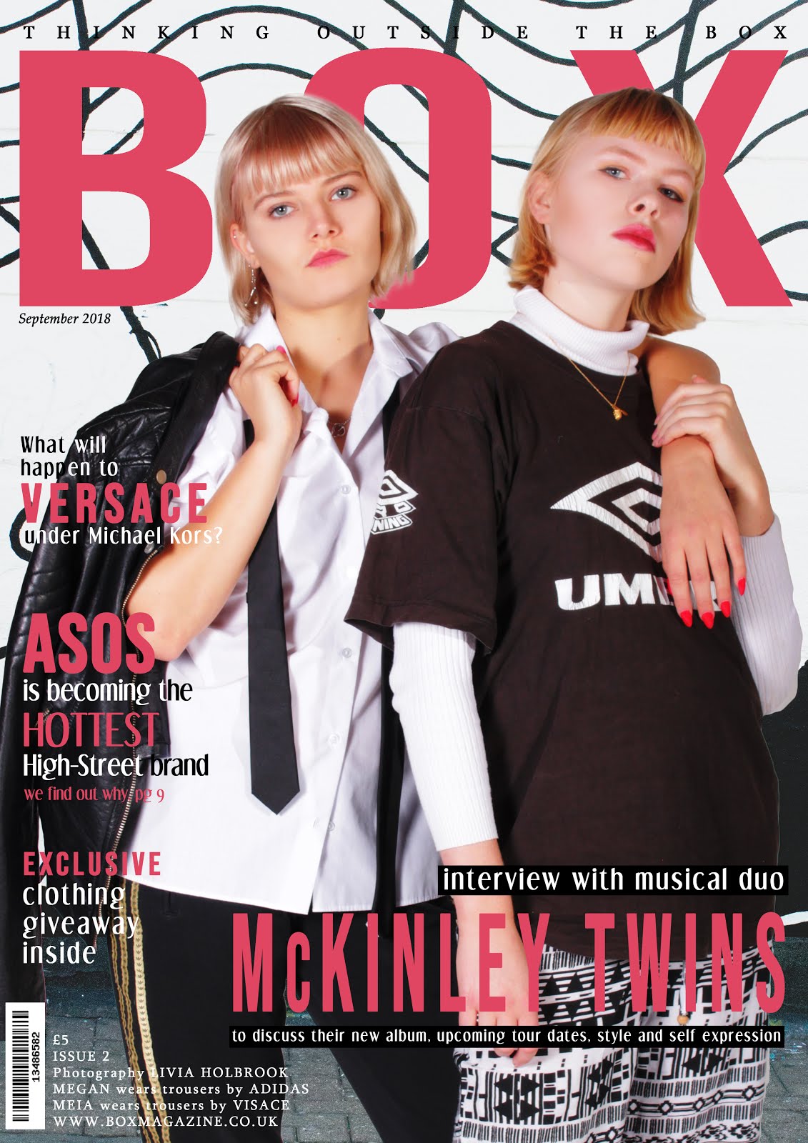
After designing my first front cover and using a male model, I decided to change my original plan for my second cover, featuring a mid shot of two female models instead. I liked the composition of this cover and wanted to play on the concept of a cover featuring twins but who are very different. I wanted to style one model in an androgynous way, and the other in a completely different and niche style in order to demonstrate how everyone is different and people should express themselves through their clothing, highlighting my magazine's key beliefs.
Photoshop Mockup

I created a mockup for my magazine using Photoshop, creating the concept of a musical duo, the McKinely Twins. I used a pink, red, black and white colour scheme. I took a picture of an interesting wall in Camden to use as my background. The article titles I chose to feature on my front cover refer to well known and mainstream brands, such as ASOS and Versace, appealing to a wide audience.
I thought that this location for my models provided a quirky and art-house vibe to my magazine, increasing my genre hybridity and appealing to an even wider audience.
Shootboard

Based on the background I chose for this issue, I decided to also style my models in black and white to enable to titles to stand out even more. I also matched my models' nails and lipstick colour to the titles of my magazine to emphasise the colours and create a striking composition.
Contents Page
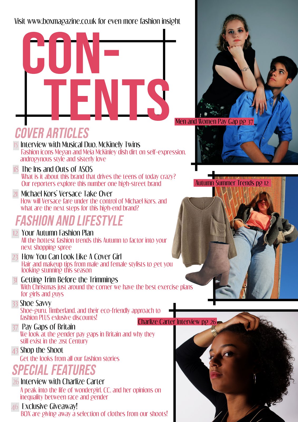
Concept Sketch
Photoshop Mockup

I created a mockup based on my sketched contents page. I kept the colour palette the same as it's related cover to enforce a sense of uniformity throughout my issue. I divided my articles into different categories of Cover Articles, Fashion and Lifestyle, and Special Features.
Shootboard


Feedback and Finished Products
I re-positioned my tagline to match the change to my first issue. My peer feedback was very positive, they especially liked my vibrant photographs in both my cover and contents page. One comment was that on my front cover some of the white writing in difficult to read. In response to this I added a black box behind the writing in order to help it stand out and easier to read. My teacher suggested that I make my 'giveaway' article explicitly link to clothing in order to match conventions and entice my reader further to pick up the magazine. In my contents page, an image of boots was covering a section of text, so I repositioned the photograph.
In my final cover, one model has an androgynous style, shown by her boxy suit shirt, tie and man's jacket. This helps confront stereotypes and challenge conventional representations of women, which will appeal to my culturally sophisticated target audience. My second model has a unique and unusual style which will appeal to my youthful audience and helps my magazine promote self-expression through clothing. The black and white theme contrasted with the pink highlights and text makes for a very striking and art-house style, contributing to my generic-hybridity.
In my finished contents page, I used three main striking images as well as two images of clothing, in correlation with typical contents page conventions. This is the same format I used for my first contents page, creating a sense of uniformity and brand identity between my magazine issues. I created article titles which would appeal to my target audience due to their association with culture, fashion, politics, student life and lifestyle, also demonstrating genre hybridity. Some articles, such as 'Pay Gaps of Britain' address specific issues which are relevant to the entirety of my target audience. I also created seasonal article titles which are relevant at the time of release, showing how my magazine is constantly updating and adapting. Articles about existing brands such as Versace and ASOS
In my finished contents page, I used three main striking images as well as two images of clothing, in correlation with typical contents page conventions. This is the same format I used for my first contents page, creating a sense of uniformity and brand identity between my magazine issues. I created article titles which would appeal to my target audience due to their association with culture, fashion, politics, student life and lifestyle, also demonstrating genre hybridity. Some articles, such as 'Pay Gaps of Britain' address specific issues which are relevant to the entirety of my target audience. I also created seasonal article titles which are relevant at the time of release, showing how my magazine is constantly updating and adapting. Articles about existing brands such as Versace and ASOS
I also included an article about an 'Exclusive Giveaway' which engages the audience and makes them want to read the issue. This article is also at the back, which means the reader will have to flick through the entire magazine in order to read about it, encouraging them to read the other articles in the issue.
Sunday, 21 October 2018
6. MAGAZINE EDITION 1: Cover and Contents Page
Cover
Inspiration

I took inspiration from this Vogue cover. I really liked the composition and the pose of the model combined with the simplistic background. I also liked the striking and contrasting colours of fonts.
Concept Sketch
My initial concept for my first cover was to have a 'Throwback' theme, featuring the strapline 'Welcoming the new by celebrating the old'. I believe this is a subtle way to introduce my new magazine without making it cliche or seem unprofessional. This also targets my demographic's interest in old fashion and thrift store clothes. Article titles relating to this theme will be featured on the cover. The title of my magazine will be in large letters in the headline. The cover image will feature a female model aged between 16 and 25 in 90s style clothing, which reflects the throwback theme, as well as appealing to my target audience.
Photoshop Mockup

When creating a mockup for my magazine I decided to instead feature an 80s look as my cover image because I thought this provided more variation and meant that I could reflect the androgynous style of men in the 80s to appeal to a wider audience and challenge media representations. For this reason, I changed my mockup to feature a close-up of a male model. I chose to use a black, white, green and gold colour palette, as I believe this to be very striking and bold. I also chose to incorporate my magazine's tagline in the header instead of 'magazine' as I believe this makes this cover more interesting and reinforces my brand identity.
Contents Page
Inspiration

I was inspired by this contents page, in particular the large photographs on the right vs the article titles on the left. I also liked the labels of the photographs with reference to their articles and page numbers.
Concept Sketch
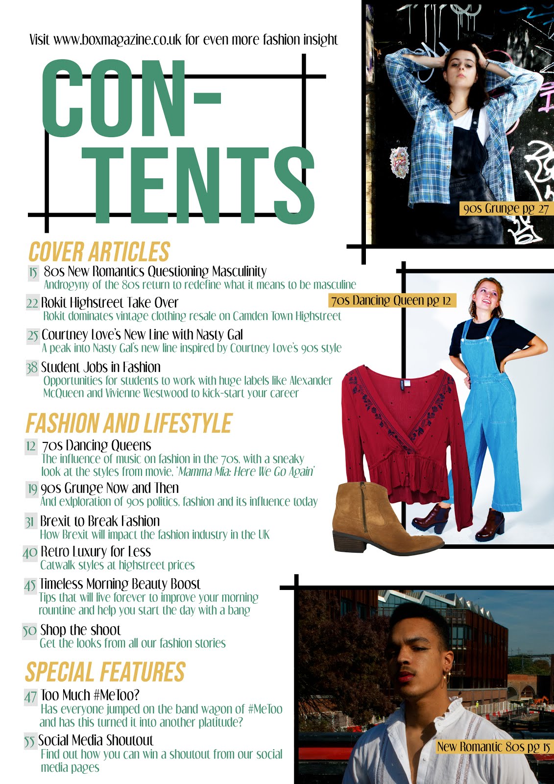
In my initial sketch for my contents page, I wanted to include three main images on the right vs all my article titles on the left. I presented my contents title in large letters surrounded by my graphic box design which features in my magazine logo, helping me to maintain a brand identity.
Photoshop Mockup

I created a mockup based on my sketched contents page. I kept the colour palette the same as my cover to enforce a sense of uniformity throughout my issue. I divided my articles into different categories of Cover Articles, Fashion and Lifestyle, and Special Features.
Feedback and Finished Products
My teachers suggested that I move my tagline on my cover to the top of the page so that it would stand out more and be easier to read. I agreed that this would draw more attention to my brand identity and stand out to my target audience. My peers' feedback on the layout of both my contents page and cover was very positive, however one thing they did suggest was to add more article titles to reflect a real magazine, as I had only included eight, so I increased this to twelve.
My finished magazine cover features a male, mixed-race model wearing androgynous clothing and makeup in the style of 80s New Romantic Fashion. This presents my magazine as challenging stereotypes of masculinity by featuring a very macho male in very feminine attire. Also, the presentation of a mix-race model demonstrates the belief in racial equality and acceptance of diversity.
In my finished contents page, I used three striking main images as well as two images of clothing, in correlation with typical contents page conventions. I created article titles which would appeal to my target audience due to their association with culture, fashion, politics, student life and lifestyle, also demonstrating genre hybridity. Some articles, such as 'Too much #metoo' also link to trends and debates present in the media at the time, showing that my magazine is of-its-time and related to current affairs. Some of these article titles, such as the 90s Grunge article, also feature on my website, demonstrating digital convergence and synergy. Digital convergence is further emphasised in an article headlide which offers a 'social media shoutout', uniting digital and print formats. There is also an article referencing the film 'Mamma Mia 2' demonstrating intertextuality.
Friday, 19 October 2018
5. Response to Brief
My brief specifies that I must produce two front covers, each with a different contents page and a working website for a magazine published by Bauer and produced by an independent production company. Throughout all the media I produce, there must be a clear sense of my magazine's brand identity and a diverse range of fashion issues and styles presented which are appropriate to the culturally sophisticated, 16-25 AB demographic.
Magazine name: BOX Magazine
Tagline: Thinking Outside the Box
Genre: Fashion, Lifestyle and Politics
Price: £5
Target Audience: Culturally sophisticated, 16-25 AB demographic
Purpose: My magazine's purpose is to appeal to all genders of my target audience by featuring information about relevant fashion news and products, giving my audience cultural insight whilst also representing particular political views which are reflective of my demographic, promoting feminism, diversity, self-expression and equality
 This is the logo I have designed for my magazine. Striking logos are very important in order to establish a successful magazine, as they unite all of your products to create a brand identity. My existing audience will need to be able to recognise the logo, but it must also catch the eye of potential readers to encourage them to take interest in my magazine and brand. I have achieved a striking and eye-catching logo through the contrasting colours of pink, black and white. I also played on the word 'box' by incorporating a physical box into my logo which is clever but also iconic. This style of box will also be used in my contents pages.
Front Covers and Contents Pages
I must produce two front covers and two contents pages. In order to establish my brand identity and appeal to my target audience, these will:
- feature the title of my magazine in bold letters using the same font
- feature the issue number and tagline in the top left corner
- feature models aged between 16-25
- feature at least two models representing at least two social groups
- feature a call to action pointing readers to the online website
- feature headlines appealing to the AB culturally sophisticated demographic
- use the same template format
- maintain fonts and style
- feature at least four original images appealing to the 16-25 AB culturally sophisticated demographic
- feature headlines appealing to the 16-25 AB culturally sophisticated demographic
In order to create an appealing and interactive website which maintains my brand identity, my homepage and the additional page will include:
- the title and logo of my magazine
- a menu bar
- a landing page
- a range of typography and at least two original images
- original audio visual-content
- working links from the homepage to the other page
- text introducing the main features of the website
- articles which reflect my magazine's beliefs
- links to two different social media platforms, Twitter and Instagram
 The name I have chosen for my independent production company is 'Neon Studios'. I chose this name based off of my research into indie production companies; most of them had very short names which were also quite striking and niche. 'Neon' connotes bright and shocking colour and vibrancy, and I would like to express this assertive and eye-catching quality to my magazine's style and photographs.
For my company logo, I used two contrasting striking colours, black and hot pink. I really like this combination and I believe its associations with punk culture helps it appeal to both guys and girls. This colour combination will be used for my magazine logo and in elements of my website in order to establish a brand identity. I added a small lightning bolt to the design as I thought this was quirky and played on the 'Neon' title.
I have located my independent production company at an address in Covent Garden, which I chose because it is a trendy and iconic place.
- maintain fonts and style
- feature at least four original images appealing to the 16-25 AB culturally sophisticated demographic
- feature headlines appealing to the 16-25 AB culturally sophisticated demographic
Website
In order to create an appealing and interactive website which maintains my brand identity, my homepage and the additional page will include:
- the title and logo of my magazine
- a menu bar
- a landing page
- a range of typography and at least two original images
- original audio visual-content
- working links from the homepage to the other page
- text introducing the main features of the website
- articles which reflect my magazine's beliefs
- links to two different social media platforms, Twitter and Instagram
Independent Production Company
 The name I have chosen for my independent production company is 'Neon Studios'. I chose this name based off of my research into indie production companies; most of them had very short names which were also quite striking and niche. 'Neon' connotes bright and shocking colour and vibrancy, and I would like to express this assertive and eye-catching quality to my magazine's style and photographs.
For my company logo, I used two contrasting striking colours, black and hot pink. I really like this combination and I believe its associations with punk culture helps it appeal to both guys and girls. This colour combination will be used for my magazine logo and in elements of my website in order to establish a brand identity. I added a small lightning bolt to the design as I thought this was quirky and played on the 'Neon' title.
I have located my independent production company at an address in Covent Garden, which I chose because it is a trendy and iconic place.
Tuesday, 18 September 2018
4. Representation
My culturally sophisticated demographic will be looking for a magazine that challenges the typical representations and stereotypes of people found in modern society. In order for my magazine to appeal to my audience I must feature a range of representations which challenge the boundaries of the fashion industry. I may do this by highlighting a variety of cultures and ethnicities, challenging racial discrimination; featuring androgynous clothing and styles, challenging gender stereotypes; using a variety of models with unique looks and body shapes, supporting self expression and promoting the beauty of diversity. Hall's representations theory explores the significance of signs and symbols giving meaning to images in the media which are decoded by the audience. He also explains how these representations heavily influence expectations within society and provide the public with aspirations to conform to these standards.

This Dec 2017 cover for ELLE magazine presents a stunning black woman with minimalistic makeup, demonstrating her natural beauty, opposing the 'edited beauty' conventions often found in magazines. The gap between her teeth is not hidden, presenting her unique look as something to be embraced and valued. The red colour of her dress matches the masthead of the magazine and the word 'sisters', the connotations of 'sister' promoting a sense of intimacy and support, demonstrating the value of acceptance and solidarity.

This Summer 2017 cover for i-D magazine shows two female models and one male model, all styled in similar ways, promoting an androgynous approach to beauty and fashion. the closeness of the models connotes friendship and acceptance of each other. Both women have very short hair and minimal makeup, giving them a more typically 'male' look, however their accessories and mannerisms create a sense of femininity. The male model portrays a sense of timidity through his body language, opposing the way men are expected to conform to masculine stereotypes. This presentation of diversity and androgyny breaks down social standards, promoting self-expression equality between all genders and opposes stereotypes.

Pride is a lifestyle and fashion magazine which specifically targets black British, mixed race, African and African-Caribbean women in the United Kingdom. It combines elements of fashion, sex and relationship advice, politics, news and sport, supporting minority ethnic groups as well as the LGBT+ community. A recent cover of the magazine featured Janelle Monáe, an African-American, pansexual performer who campaigns for women's rights. Immediately, when viewers see this magazine, they understand their values and can relate to the cover.
In my own magazine, I will present different representations through my variety of photographs featuring a range of models, a range of article titles and descriptions, and the use of my tagline 'thinking outside the box', which promotes self-expression and diversity, encouraging my readers to be proud of their individuality. My website will also feature several stories which express my magazine's values and opinions on social issues, such as racism, sexism and homophobia, as well as political issues, such as unethical practice in fashion, Brexit and student finance. In relation to Gerbener's cultivation theory, I will expose my readers to a variety of accurate representations of social groups in order to combat stereotypes and assumptions consumers make when exposed to mass media.
Monday, 17 September 2018
3. Codes and Conventions
Front Covers


This cover is more minimalist than most fashion magazines, with a plain background and little information about the issue inside. The magazine name is in large print alongside the model, and contains the hidden logo of a winking face, which the model also expresses. This use of hidden connotations allows the target audience to engage with the magazine. The subheading 'Super Youth' addresses the target audience and appeals to the young demographic, a technique documented by Barthes in his theory of Identity. I really like the striking hair and makeup of the model and how this contrasts her dark clothes. Again, this magazine has utilised complementary colours, matching the subtext colour to the nail varnish of the model.

Based on my research, I can identify the main features of conventional magazines and incorporate these in my own magazine covers. These include
- main image of a model - this will often show the magazine's brand identity and highlight to the reader the genre and intended target audience of the magazine.
- background - often plain colours or a gradient, can also be a location shot which is typically out of focus to highlight the model
- masthead - a key part of the magazines branding found at the top of the page in a bold font
- headlines - the number of these on the cover varies; more will suggest that the magazine is packed with content but connote a gossip style, whereas less will show the magazines sophisticated style
- issue number and date - often in the top left corner
- bar code - often found in the bottom right corner
- price - in variable positions
- tagline - reinforces brand identity and magazine purpose
- call to action to the website- to encourage readers to look for more content online.
- direct address- can be done through the model's body language or through the choice of language. This can create a connection between the reader and magazine and encourage them to purchase it.
- colour palette - a clear colour scheme that can used to link different elements on a cover or add aesthetic
- semiotics - signs and symbols create representations which the audience can identify with/understand. Barthes explores the ways elements present connotations to be decoded by the audience
Contents Pages


- a grid layout with lists of articles and page numbers.
- white background - this draws the readers attention to the images and contents headlines featured
- a collection of images - can be spread out or overlapping with the contents running down the side
- a masthead- will normally contain a large 'contents' heading and some may have the magazine's title instead or in addition
- can be a single or double page spread
- a web address or information on how to subscribe to the magazine featured at the bottom or top of the page
Websites
The website of a magazine is used to provide their audience with information about the brand and encourage them to buy it. It also provides audiences with the opportunity for interactivity, enabling them to navigate the site, view media and subscribe to the magazine or newsletters.

This website has a white main background which draws more attention to the images and text. It features social media links in the top right corner. The title of the magazine and a menu bar feature center-top. There is a large image extending across the whole width of the page with a link to the article it references. Below this there is a large call to action to subscribe to the magazine and weekly newsletter. Similarly, in the top left there is a link to subscribe to the magazine with images of the most recent cover. There is a search bar in the middle of the page. As you scroll down the page, articles and features are laid out in a grid format and separated into categories such as 'Fashion' and 'Lifestyle'.


This is an additional fashion page for the same website. The formatting is very similar to the homepage, with a grid of articles which open up in separate tabs The title and logo of the magazine is still featured in the masthead and the drop-down menu is still accessible from the top left.
 Websites also commonly show a small thumbnail of their latest issue in the top left corner of the website header. This is accompanied by a short line about subscription details and a link to subscribe to the magazine.
Based on my research I can identify the main features of conventional websites and incorporate these in my own. These conventions are as follows:
- a main menu bar - normally at the top of the page beneath the masthead
- links to different pages of the website - normally related to featured images
- the magazine's title and logo - often at the top of the page in the masthead
- the magazine's tagline - often included in the masthead below the title
- subscription - constant promotion and buttons to subscribe
- landing page - a tab popping up when the website first opens which greets the viewer and encourages them to subscribe to the magazine
- social media links - normally in the top right corner
- footer with options for subscription, information and contact link
- audio-visual content - found throughout the website to engage audience
- white background with a grid format of images
- Synergy - the stories overlap with others featured in the physical magazines and sometimes provide further detail. The articles also cross over with their social media pages
- a search bar - can be in at the top of the page near the menu or under the masthead
- a variety of different images with links to different pages on the website
Friday, 14 September 2018
2. Industry
Publisher and Creator
My magazine is going to be published by Bauer, Europe’s largest privately-owned media group and Britain’s biggest magazine publisher, reaching over 23 million consumers in the UK alone. They print over 600 magazines worldwide from a wide range of genres, including Empire, Bella and Heat.

Their website slogan is 'We Think Popular', linking their focus to mainstream values and themes, tailoring to the majority of people. They describe themselves as building 'strong cultural connections, drawing people together with the things that they really care about'. In response to this, I should make sure my magazine reflects Bauer's values by featuring mainstream trends as well as supporting a culturally diverse society and promoting the act of sharing among my readers.
 Bauer Publishing's main fashion magazine is Grazia. The Bauer website describes Grazia as 'brave, bold and innovative', elements I hope to exhibit in my own magazine. Grazia also tailors to the AB and culturally sophisticated demographic. However, in contrast to my magazine, Grazia's audience is predominantly female with a core readership of women aged 25-45. These distinctions between our magazines enables Bauer to publish both without fear of competition between them.
 My magazine has been created by an 'independent media production company'. Independent production companies often target smaller, niche audiences and do not always conform to the typical conventions of industrial magazines. However, as my magazine is being published by Bauer and intended for retail sale, I must make the compromise of maintaining certain conventional elements which will appeal to large audiences, whilst still creating a magazine with a unique and independent feel. An example of a successful independent magazine production company is Kinfolk Magazine, whose publication has spread worldwide and been translated into Chinese, Russian and Japanese. It currently holds a readership of over 55,000. Published by Ouur, Kinfolk has created a "distinct ripple in the publishing world with an aesthetic all its own", states Portland monthly.
Technological Convergence and Synergy

Nowadays, with the growth of technology and social media, it is important for magazines to reach and engage their audience online. They can do this by creating a website and managing social media accounts which are updated regularly to constantly keep their viewers informed. Across all their online platforms, magazines must maintain a synergised brand identity which is recognisable to their audience. For example, on ELLE UK's Instagram page, their icon is the latest issue of their magazine, demonstrating technological convergence by uniting their product with their online media. They also have created a hyperlink to their webpage in their Insta bio, creating synergy by connecting their different online platforms.
Regulation
The IPSO (Independant Press Standards Organistion) is 'the independent regulator of most of the UK’s newspapers and magazines'. They are financed by the Regulatory Funding Company (RFC) which is funded by member publications. Their job is to ensure that all publications comply with the Editors' Code: a set of rules written by the Editors’ Code Committee and updated every year. This ensures that any publication has integrity and is not harmful or offensive to anyone within society. They also ensure that all magazine content is original and not intellectual property of another company or individual, and provide a 24-hour harassment helpline service for people feeling threatened or objectified by the press.
Funding
Most magazines receive revenue from both the cover price of their magazines as well as advertising. As the majority of my magazine's revenue will come from advertising, it is important that it is presented as an attractive platform for advertisers. I will do this by creating my magazine to appeal to a large audience. This can be done by featuring a wide range of mainstream topics which appeal to a variety of people, and keeping the price of my magazine low so as to attract more people to buy it. My specified 16-25 culturally sophisticated AB demographic will also enable advertisers to tailor their featured ads so that they can target my readership.
Current trends in the industry

Covers published since September 2018 have seen an increase in diversity by more than 30%, with black women heavily featured on the covers of top magazines such as Vogue, Glamour, Marie Claire and Cosmopolitan. This increase in racial diversity marks a new wave of fashion magazines which are showing support for equality and individuality. This is a trend I would like to harness within my own magazine in order to promote diversity and appeal to a broad range of people.

Current fashion trends popular among the 16-25 demographic include Street Style fashion and the re-vamping of old or thrift clothes, featuring styles from 1960-90. An example of this can be seen through the release of Nasty Gal designer's new collaboration line with Courtney Love, reviving the 'babydoll' dresses from the 90s. I could appeal to my target audience effectively by incorporating features on this trend in my magazine and website.
Subscribe to:
Posts (Atom)