Initial Concept Sketch
Mockup
Finished Product
When my audience first arrive on my website they are greeted by a popup landing page which welcomes them and encourages them to subscribe to my magazine with the deal of getting their first issue free. This makes my demographic more likely to subscribe to my magazine as they can try out the first issue free and see if they like the magazine.

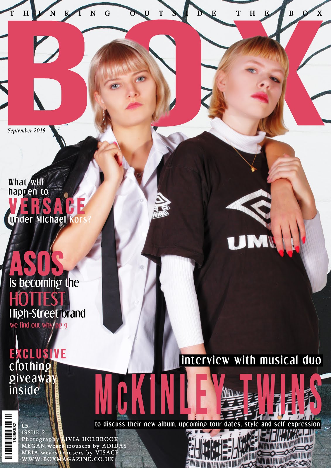
This is the header of my website which will feature at the top of each linked page. I incorporated a small thumbnail of my latest magazine issue (second issue) which will be updated with every new issue. Next to this is information about subscribing to my magazine which costs £3.99 per month. My main header image is bold and striking. It remains stationary when the viewer scrolls down the page which creates an interesting effect. Also in my header is a navigation bar which features different page titles. There is also a search bar, which enables my audience to look for specific articles and features with ease, and links to my magazine's Twitter and Instagram accounts, demonstrating the online presence and synergy of my magazine. There is also the option to share my website on Facebook, which will boost my magazine's reach and viewers.

Directly underneath my header is a large moving graphic which changes when the mouse cursor moves over it to promote subscribing to my magazine. This is engaging for my audience and helps my website stand out on the page. Below this is my magazine's tagline in large letters which helps to reinforce my brand identity.
My main article will change every day, but currently shows a story about the LGBT+ community in London. This helps to demonstrate my magazine's values and support of LGBT+. The photograph is also very colourful and vibrant, engaging the audience straight away. Some of the 'Top Stories' crossover with stories featured in my contents page and front covers. This demonstrates digital convergence and brand identity.

My audiovisual content fills the page which a large title which encourages the reader to watch it. When the video is clicked it opens up a new dialogue box with an additional description of the video, providing the audience with an interactive element and giving them further insight into the purpose of the video. The video also features on Twitter and Instagram, demonstrating the synergy of my magazine online.
This section of my homepage is titled 'Tick the Box' which not only plays on the magazine's title, but also provides political and democratic connotations, uniting the genres of both fashion and politics. Here, I have shown that my magazine values fashion ethics and opposes the use of fur in fashion. This will appeal to my 16-25 culturally sophisticated demographic who are aware of the issues within the fashion industry. There is also an interactive element through the use of buttons which take the viewer to the organisation mentioned.

I embedded my Instagram and Twitter feeds into the homepage of my website to emphasise my brand synergy as well as further encourage my audience to look at my magazine's social media which they can like and share, providing them with interactivity and engagement in my brand. This also demonstrates a sense of connectivity and immediacy through the fact that it is constantly being updated and informing my audience about my brand and magazine.

I created a feedback box at the bottom of my website which provides my audience with an interactive element and also allows my magazine to monitor my viewers and track if it's attracting my target audience.

My footer features details about my publisher, Bauer Media, and independent production company, Neon Studios. It also provides links to my magazine's T&Cs, code of conduct, contact details etc.
Feedback
My teachers advised me that I should include another article of culturally or politically relevant article in order to interest my target market even further as well as driving my magazine's generic hybridity and values. I chose to create an article around Brexit's impact on the UK fashion industry, which will greatly interest my fashion-savvy audience, especially since the 18-25 group predominantly voted to remain in the UK during the referendum, demonstrating how my magazine reflects my audience's own opinions.
I was also advised to include a political section in my navigation header which I thought was a good idea in order to demonstrate and strengthen my magazine's focus on political affairs.


No comments:
Post a Comment