

Cover
Inspiration

I took inspiration from this Vogue cover. I really liked the composition and the pose of the model combined with the simplistic background. I also liked the striking and contrasting colours of fonts.
Concept Sketch
My initial concept for my first cover was to have a 'Throwback' theme, featuring the strapline 'Welcoming the new by celebrating the old'. I believe this is a subtle way to introduce my new magazine without making it cliche or seem unprofessional. This also targets my demographic's interest in old fashion and thrift store clothes. Article titles relating to this theme will be featured on the cover. The title of my magazine will be in large letters in the headline. The cover image will feature a female model aged between 16 and 25 in 90s style clothing, which reflects the throwback theme, as well as appealing to my target audience.
Photoshop Mockup

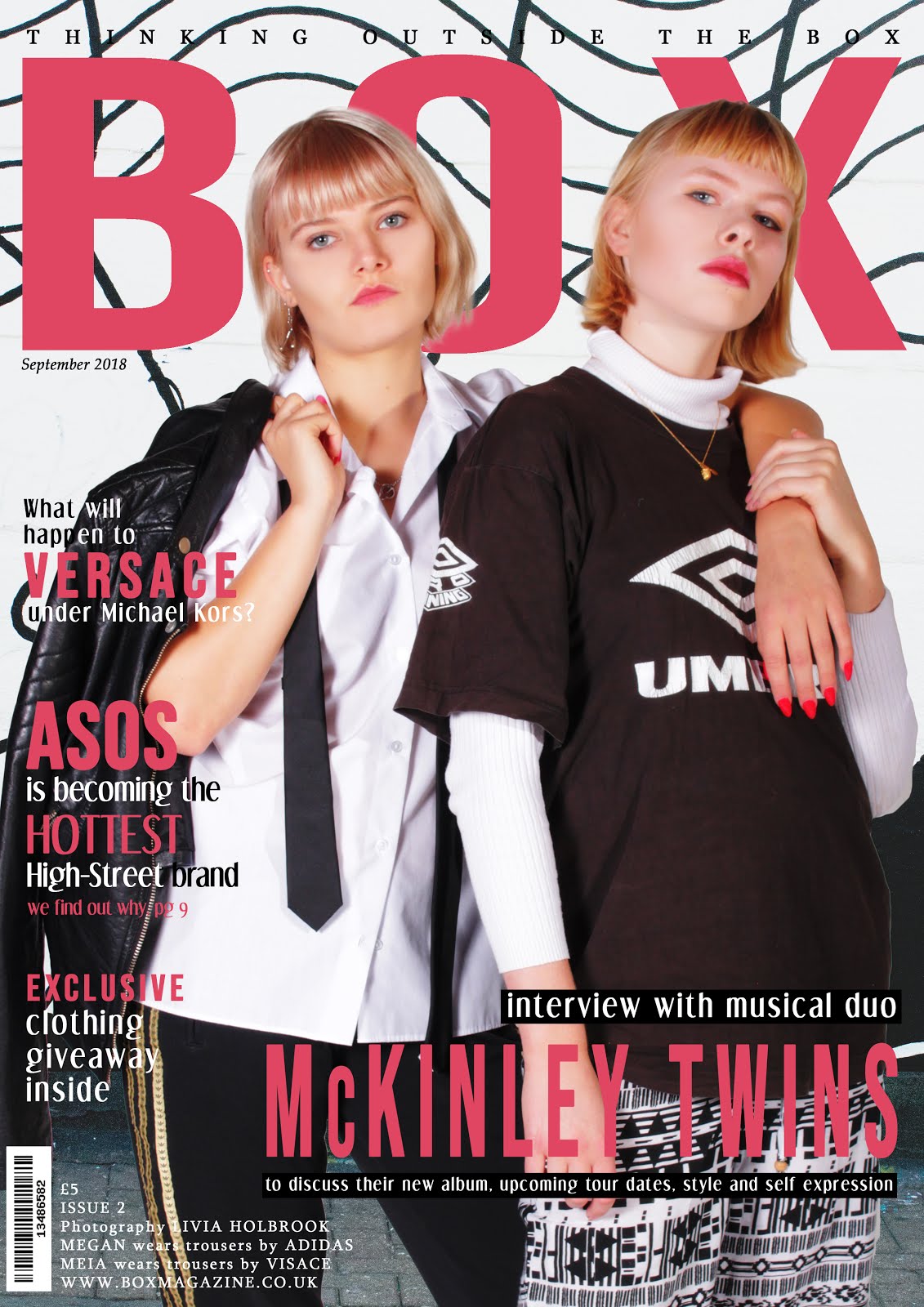
When creating a mockup for my magazine I decided to instead feature an 80s look as my cover image because I thought this provided more variation and meant that I could reflect the androgynous style of men in the 80s to appeal to a wider audience and challenge media representations. For this reason, I changed my mockup to feature a close-up of a male model. I chose to use a black, white, green and gold colour palette, as I believe this to be very striking and bold. I also chose to incorporate my magazine's tagline in the header instead of 'magazine' as I believe this makes this cover more interesting and reinforces my brand identity.
Contents Page
Inspiration

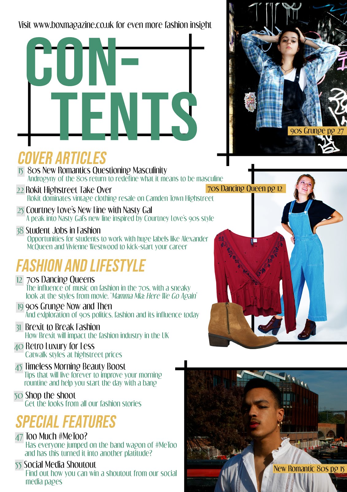
I was inspired by this contents page, in particular the large photographs on the right vs the article titles on the left. I also liked the labels of the photographs with reference to their articles and page numbers.
Concept Sketch
In my initial sketch for my contents page, I wanted to include three main images on the right vs all my article titles on the left. I presented my contents title in large letters surrounded by my graphic box design which features in my magazine logo, helping me to maintain a brand identity.
Photoshop Mockup

I created a mockup based on my sketched contents page. I kept the colour palette the same as my cover to enforce a sense of uniformity throughout my issue. I divided my articles into different categories of Cover Articles, Fashion and Lifestyle, and Special Features.
Feedback and Finished Products
My teachers suggested that I move my tagline on my cover to the top of the page so that it would stand out more and be easier to read. I agreed that this would draw more attention to my brand identity and stand out to my target audience. My peers' feedback on the layout of both my contents page and cover was very positive, however one thing they did suggest was to add more article titles to reflect a real magazine, as I had only included eight, so I increased this to twelve.
My finished magazine cover features a male, mixed-race model wearing androgynous clothing and makeup in the style of 80s New Romantic Fashion. This presents my magazine as challenging stereotypes of masculinity by featuring a very macho male in very feminine attire. Also, the presentation of a mix-race model demonstrates the belief in racial equality and acceptance of diversity.
In my finished contents page, I used three striking main images as well as two images of clothing, in correlation with typical contents page conventions. I created article titles which would appeal to my target audience due to their association with culture, fashion, politics, student life and lifestyle, also demonstrating genre hybridity. Some articles, such as 'Too much #metoo' also link to trends and debates present in the media at the time, showing that my magazine is of-its-time and related to current affairs. Some of these article titles, such as the 90s Grunge article, also feature on my website, demonstrating digital convergence and synergy. Digital convergence is further emphasised in an article headlide which offers a 'social media shoutout', uniting digital and print formats. There is also an article referencing the film 'Mamma Mia 2' demonstrating intertextuality.
No comments:
Post a Comment