

Cover
Initial Inspiration

Concept Sketch
Secondary Inspiration

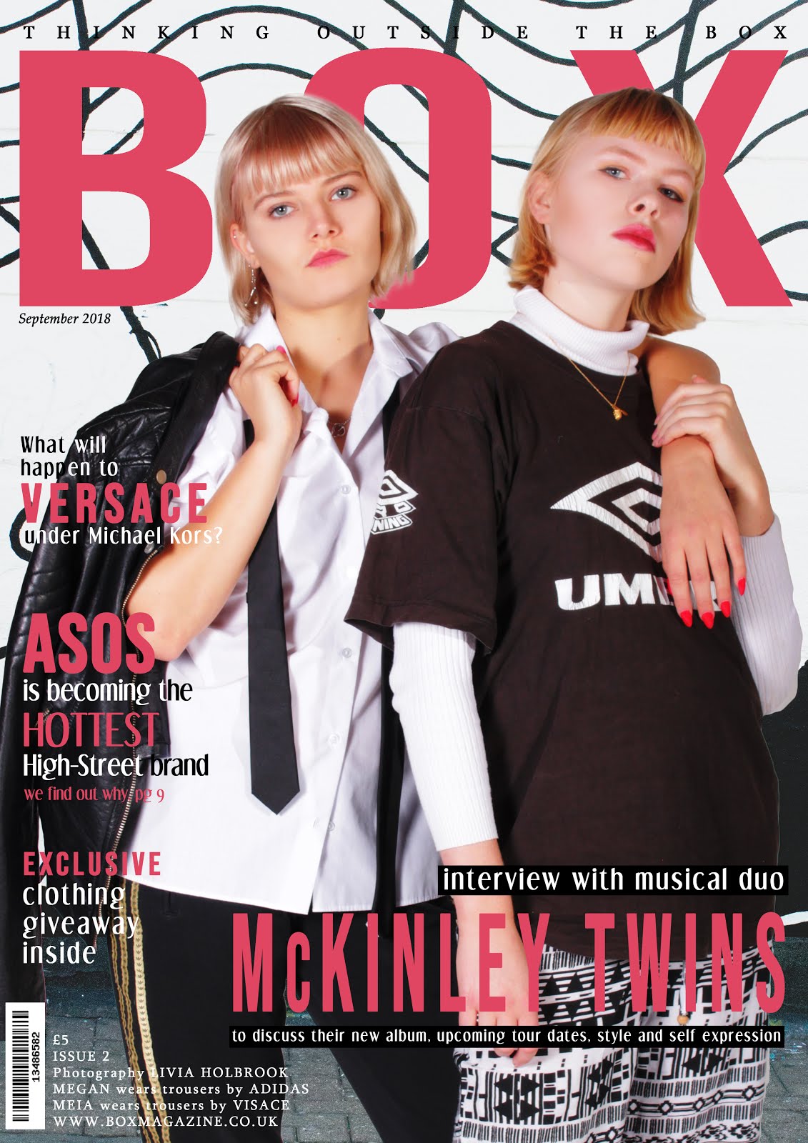
After designing my first front cover and using a male model, I decided to change my original plan for my second cover, featuring a mid shot of two female models instead. I liked the composition of this cover and wanted to play on the concept of a cover featuring twins but who are very different. I wanted to style one model in an androgynous way, and the other in a completely different and niche style in order to demonstrate how everyone is different and people should express themselves through their clothing, highlighting my magazine's key beliefs.
Photoshop Mockup

I created a mockup for my magazine using Photoshop, creating the concept of a musical duo, the McKinely Twins. I used a pink, red, black and white colour scheme. I took a picture of an interesting wall in Camden to use as my background. The article titles I chose to feature on my front cover refer to well known and mainstream brands, such as ASOS and Versace, appealing to a wide audience.
I thought that this location for my models provided a quirky and art-house vibe to my magazine, increasing my genre hybridity and appealing to an even wider audience.
Shootboard

Based on the background I chose for this issue, I decided to also style my models in black and white to enable to titles to stand out even more. I also matched my models' nails and lipstick colour to the titles of my magazine to emphasise the colours and create a striking composition.
Contents Page
Concept Sketch
Photoshop Mockup

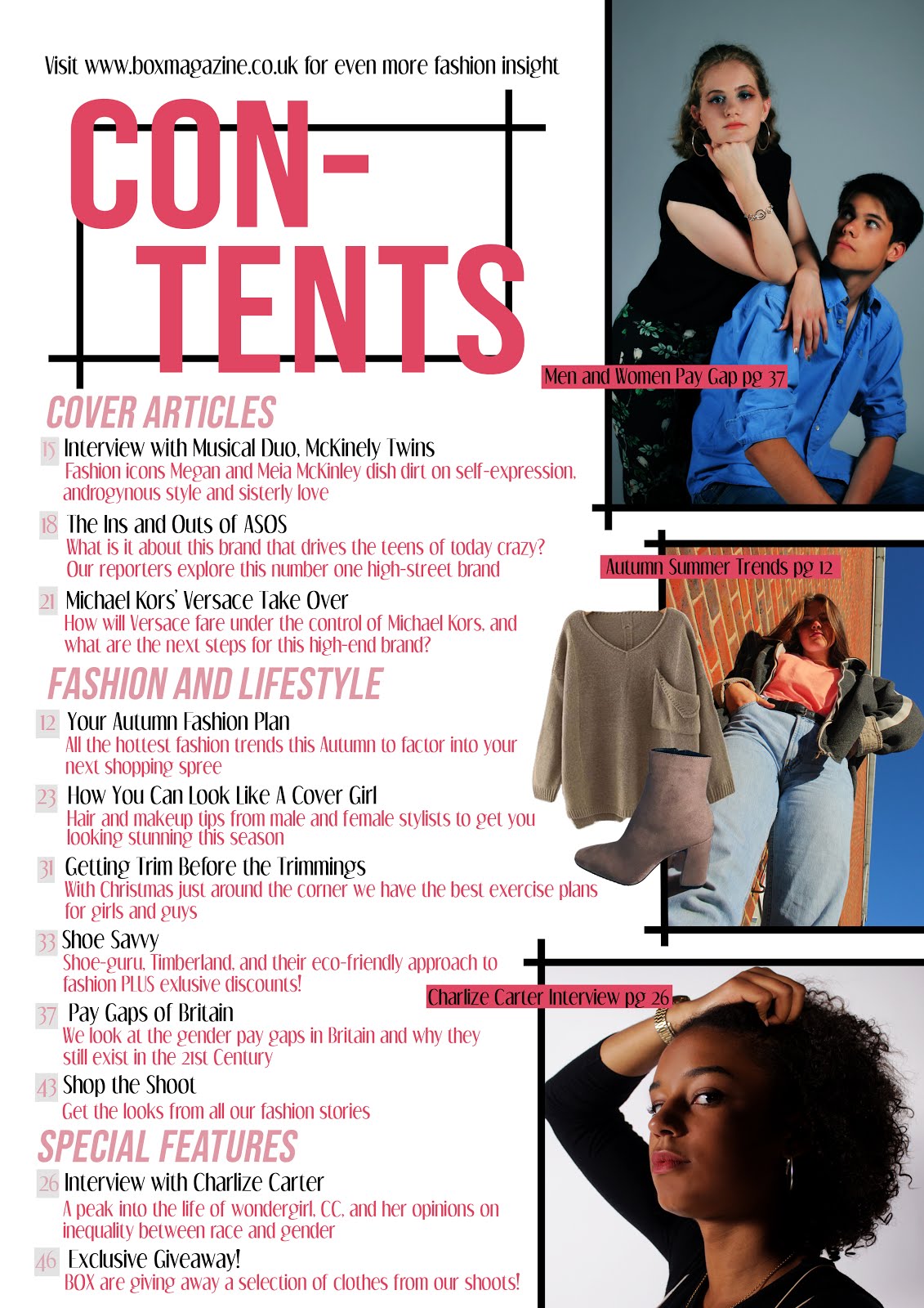
I created a mockup based on my sketched contents page. I kept the colour palette the same as it's related cover to enforce a sense of uniformity throughout my issue. I divided my articles into different categories of Cover Articles, Fashion and Lifestyle, and Special Features.
Shootboard


Feedback and Finished Products
I re-positioned my tagline to match the change to my first issue. My peer feedback was very positive, they especially liked my vibrant photographs in both my cover and contents page. One comment was that on my front cover some of the white writing in difficult to read. In response to this I added a black box behind the writing in order to help it stand out and easier to read. My teacher suggested that I make my 'giveaway' article explicitly link to clothing in order to match conventions and entice my reader further to pick up the magazine. In my contents page, an image of boots was covering a section of text, so I repositioned the photograph.
In my final cover, one model has an androgynous style, shown by her boxy suit shirt, tie and man's jacket. This helps confront stereotypes and challenge conventional representations of women, which will appeal to my culturally sophisticated target audience. My second model has a unique and unusual style which will appeal to my youthful audience and helps my magazine promote self-expression through clothing. The black and white theme contrasted with the pink highlights and text makes for a very striking and art-house style, contributing to my generic-hybridity.
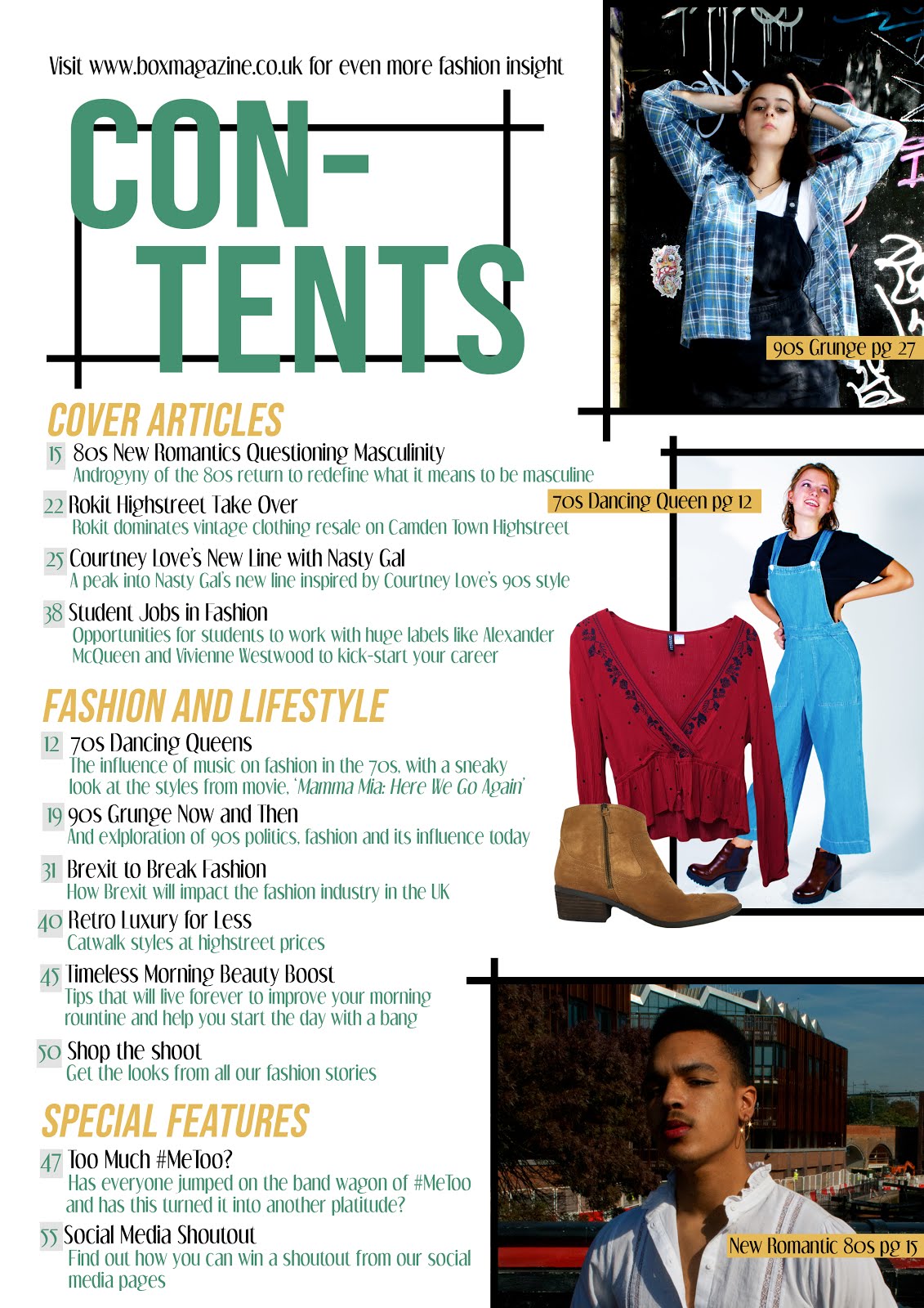
In my finished contents page, I used three main striking images as well as two images of clothing, in correlation with typical contents page conventions. This is the same format I used for my first contents page, creating a sense of uniformity and brand identity between my magazine issues. I created article titles which would appeal to my target audience due to their association with culture, fashion, politics, student life and lifestyle, also demonstrating genre hybridity. Some articles, such as 'Pay Gaps of Britain' address specific issues which are relevant to the entirety of my target audience. I also created seasonal article titles which are relevant at the time of release, showing how my magazine is constantly updating and adapting. Articles about existing brands such as Versace and ASOS
In my finished contents page, I used three main striking images as well as two images of clothing, in correlation with typical contents page conventions. This is the same format I used for my first contents page, creating a sense of uniformity and brand identity between my magazine issues. I created article titles which would appeal to my target audience due to their association with culture, fashion, politics, student life and lifestyle, also demonstrating genre hybridity. Some articles, such as 'Pay Gaps of Britain' address specific issues which are relevant to the entirety of my target audience. I also created seasonal article titles which are relevant at the time of release, showing how my magazine is constantly updating and adapting. Articles about existing brands such as Versace and ASOS
I also included an article about an 'Exclusive Giveaway' which engages the audience and makes them want to read the issue. This article is also at the back, which means the reader will have to flick through the entire magazine in order to read about it, encouraging them to read the other articles in the issue.
No comments:
Post a Comment