

Target Audience Feedback
Covers and Contents Pages


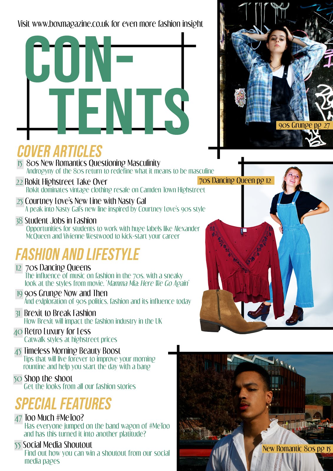
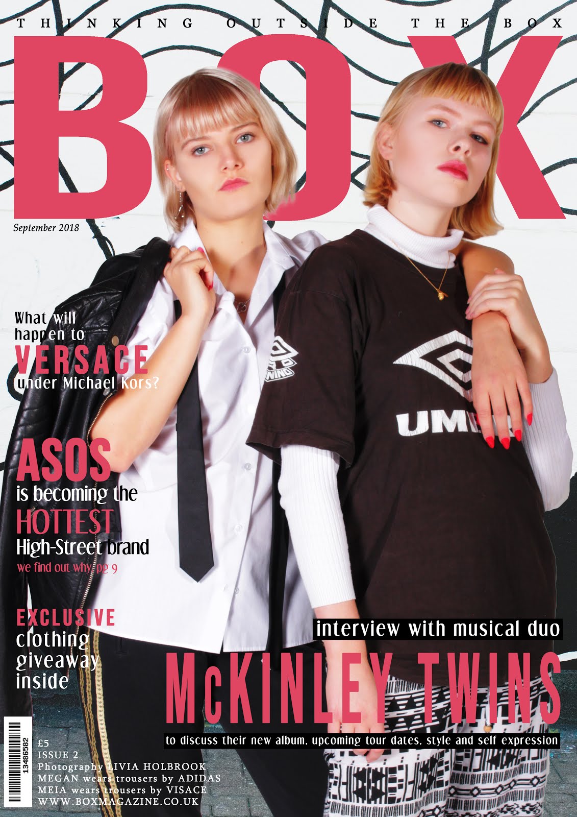
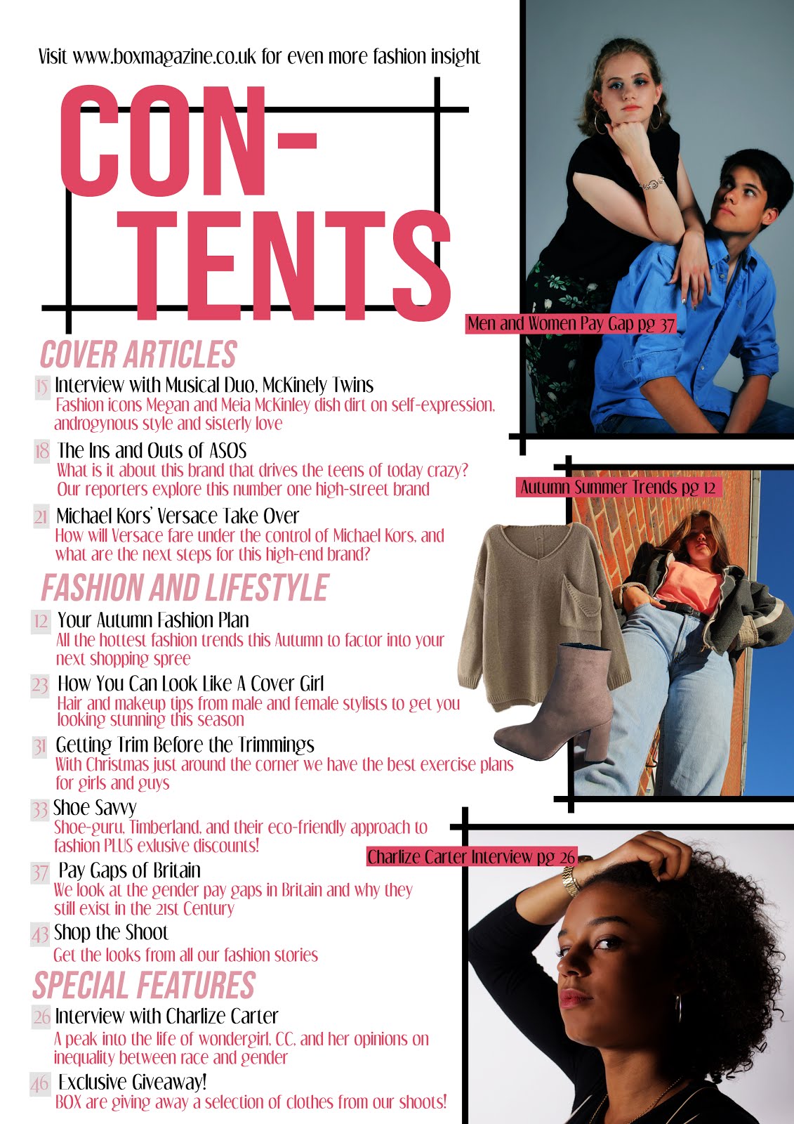
 In general, the majority of the feedback was very positive. 8/10 people agreed that the magazine was appropriate for the 16-25 market, and those who disagreed were both males. This correlates with my feedback that only 7/10 agreed the magazine appealed to both men and women. This has indicated that if I were to change my product, I would have to add more male-oriented content in order to captivate the unisex market. 100% of those I asked agreed that the opinions reflected in my product matched their own ideals as well as targeting a sophisticated and fashion-savvy market. 50% of people agreed that they would purchase the magazine if they saw it on a retail shelf, which suggests my magazine is more niche than mainstream, conforming to the conventions of an independently produced fashion magazine, however if I were to make changes I may have included more mainstream imagery to appeal to a wider audience. A common additional comment was that my contents page was quite crowded, so I could have made my text and images smaller to create more space and not overwhelm my audience.
Website

Final Reflections
In conclusion, I am very satisfied with my outcomes of this project. I believe there were only minor issues with my print work in terms of appealing to my demographic and overall their aesthetic and representation of values was a huge success. I am most pleased with my website which not only specifically appeals to my target audience, but is also engaging, attractive and presents positive messages around self-acceptance, equality and diversity.
No comments:
Post a Comment