

Magazine name: BOX Magazine
Tagline: Thinking Outside the Box
Genre: Fashion, Lifestyle and Politics
Price: £5
Target Audience: Culturally sophisticated, 16-25 AB demographic
Purpose: My magazine's purpose is to appeal to all genders of my target audience by featuring information about relevant fashion news and products, giving my audience cultural insight whilst also representing particular political views which are reflective of my demographic, promoting feminism, diversity, self-expression and equality
 This is the logo I have designed for my magazine. Striking logos are very important in order to establish a successful magazine, as they unite all of your products to create a brand identity. My existing audience will need to be able to recognise the logo, but it must also catch the eye of potential readers to encourage them to take interest in my magazine and brand. I have achieved a striking and eye-catching logo through the contrasting colours of pink, black and white. I also played on the word 'box' by incorporating a physical box into my logo which is clever but also iconic. This style of box will also be used in my contents pages.
Front Covers and Contents Pages
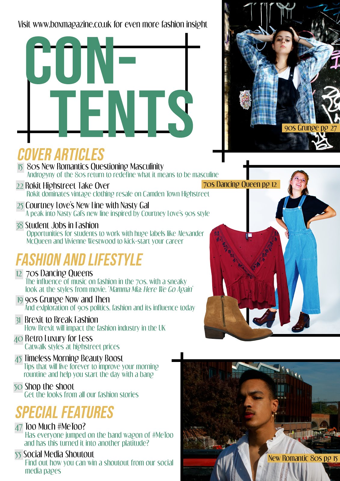
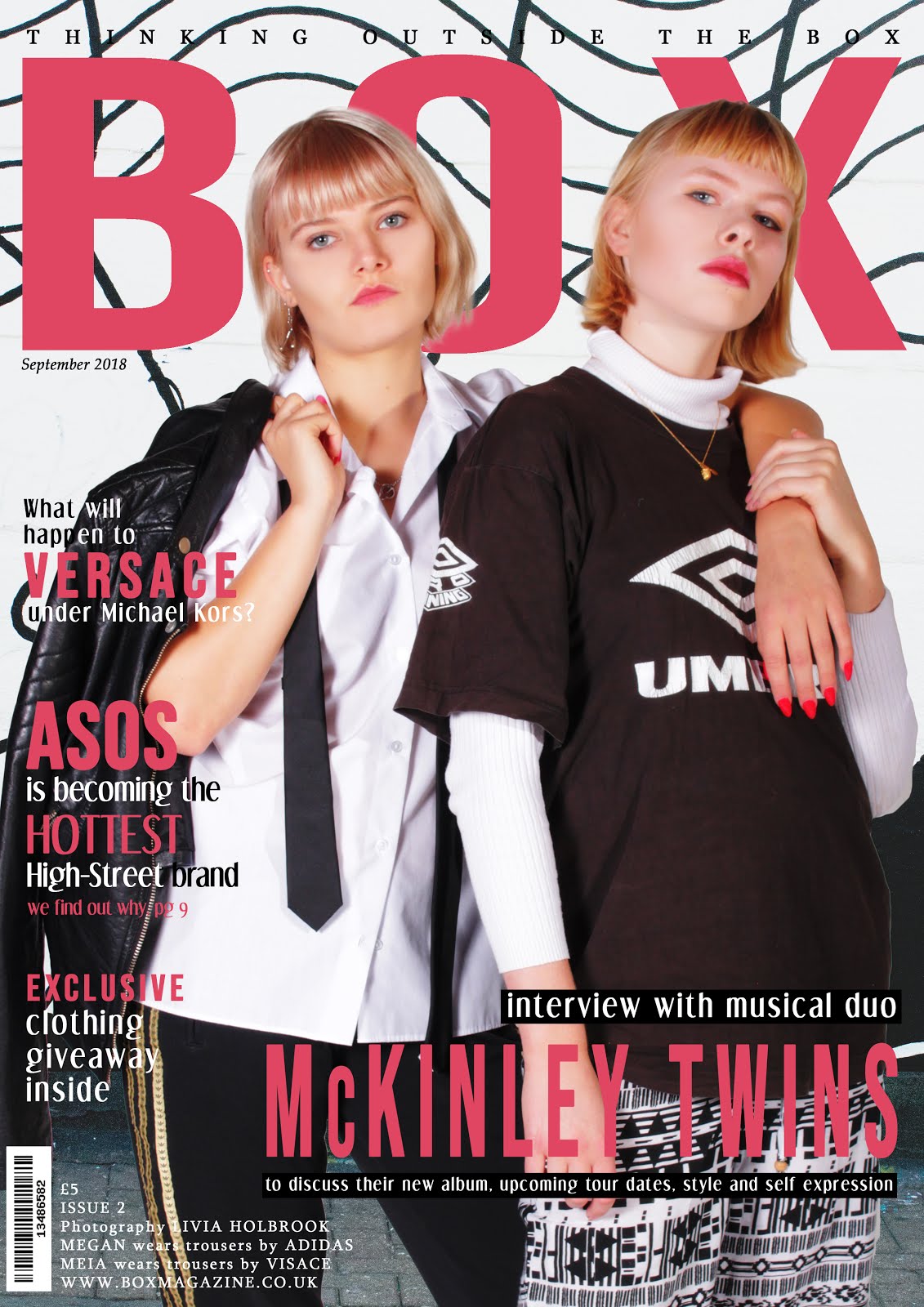
I must produce two front covers and two contents pages. In order to establish my brand identity and appeal to my target audience, these will:
- feature the title of my magazine in bold letters using the same font
- feature the issue number and tagline in the top left corner
- feature models aged between 16-25
- feature at least two models representing at least two social groups
- feature a call to action pointing readers to the online website
- feature headlines appealing to the AB culturally sophisticated demographic
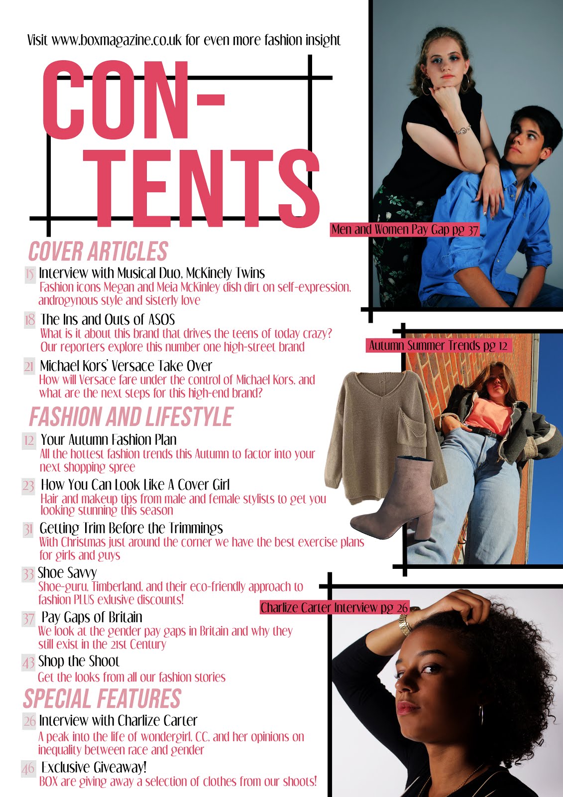
- use the same template format
- maintain fonts and style
- feature at least four original images appealing to the 16-25 AB culturally sophisticated demographic
- feature headlines appealing to the 16-25 AB culturally sophisticated demographic
In order to create an appealing and interactive website which maintains my brand identity, my homepage and the additional page will include:
- the title and logo of my magazine
- a menu bar
- a landing page
- a range of typography and at least two original images
- original audio visual-content
- working links from the homepage to the other page
- text introducing the main features of the website
- articles which reflect my magazine's beliefs
- links to two different social media platforms, Twitter and Instagram
 The name I have chosen for my independent production company is 'Neon Studios'. I chose this name based off of my research into indie production companies; most of them had very short names which were also quite striking and niche. 'Neon' connotes bright and shocking colour and vibrancy, and I would like to express this assertive and eye-catching quality to my magazine's style and photographs.
For my company logo, I used two contrasting striking colours, black and hot pink. I really like this combination and I believe its associations with punk culture helps it appeal to both guys and girls. This colour combination will be used for my magazine logo and in elements of my website in order to establish a brand identity. I added a small lightning bolt to the design as I thought this was quirky and played on the 'Neon' title.
I have located my independent production company at an address in Covent Garden, which I chose because it is a trendy and iconic place.
- maintain fonts and style
- feature at least four original images appealing to the 16-25 AB culturally sophisticated demographic
- feature headlines appealing to the 16-25 AB culturally sophisticated demographic
Website
In order to create an appealing and interactive website which maintains my brand identity, my homepage and the additional page will include:
- the title and logo of my magazine
- a menu bar
- a landing page
- a range of typography and at least two original images
- original audio visual-content
- working links from the homepage to the other page
- text introducing the main features of the website
- articles which reflect my magazine's beliefs
- links to two different social media platforms, Twitter and Instagram
Independent Production Company
 The name I have chosen for my independent production company is 'Neon Studios'. I chose this name based off of my research into indie production companies; most of them had very short names which were also quite striking and niche. 'Neon' connotes bright and shocking colour and vibrancy, and I would like to express this assertive and eye-catching quality to my magazine's style and photographs.
For my company logo, I used two contrasting striking colours, black and hot pink. I really like this combination and I believe its associations with punk culture helps it appeal to both guys and girls. This colour combination will be used for my magazine logo and in elements of my website in order to establish a brand identity. I added a small lightning bolt to the design as I thought this was quirky and played on the 'Neon' title.
I have located my independent production company at an address in Covent Garden, which I chose because it is a trendy and iconic place.
No comments:
Post a Comment